Selecting the right font for a zinc alloy label is a crucial decision that can significantly impact the overall appearance, readability, and brand identity of your product. As a professional zinc alloy labels supplier, I have witnessed firsthand the importance of choosing the appropriate font to convey the intended message effectively. In this blog post, I will share some insights and guidelines on how to select the right font for your zinc alloy labels, ensuring that your products stand out in the market.
Understand the Purpose of Your Zinc Alloy Labels
Before delving into font selection, it is essential to understand the purpose of your zinc alloy labels. Are they used for identification, branding, or decoration? Different purposes may require different fonts to achieve the desired effect.
- Identification Labels: If your zinc alloy labels are primarily used for identification, such as on industrial equipment or machinery, readability should be your top priority. Choose a clear, simple, and easy-to-read font, such as Arial, Helvetica, or Verdana. These sans-serif fonts are known for their legibility, even at small sizes, making them ideal for labels that need to be quickly and accurately read.
- Branding Labels: When using zinc alloy labels for branding, the font should reflect your brand's personality, values, and image. For example, a modern and innovative brand may opt for a sleek and minimalist font, while a traditional and classic brand may choose a more ornate and elegant font. Consider the overall brand identity and existing visual elements when selecting a font for branding labels.
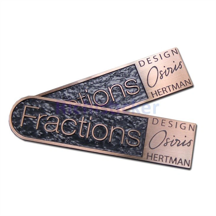
- Decorative Labels: For decorative purposes, such as on jewelry or collectibles, the font can be more creative and expressive. You can experiment with unique and artistic fonts to add a touch of personality and charm to your zinc alloy labels. However, ensure that the font remains legible and does not overshadow the overall design.
Consider the Readability and Legibility of the Font
Readability and legibility are two critical factors to consider when selecting a font for your zinc alloy labels. Readability refers to how easily the text can be read in a continuous block, while legibility refers to how easily individual letters can be distinguished from one another.
- Font Size: The font size should be large enough to be read comfortably from a reasonable distance. Consider the intended viewing distance and the size of the label when choosing the font size. As a general rule of thumb, a font size of at least 8 points is recommended for labels that will be read up close, while larger font sizes may be required for labels that will be viewed from a distance.
- Font Style: Sans-serif fonts are generally more legible than serif fonts, especially at small sizes. Sans-serif fonts have clean and simple lines, making them easier to read on screens and in low-light conditions. However, serif fonts can add a touch of elegance and sophistication to your labels, making them a good choice for formal or traditional designs.
- Font Weight: The font weight refers to the thickness of the letters in a font. A heavier font weight can make the text more prominent and easier to read, while a lighter font weight can create a more delicate and subtle effect. Consider the overall design and the intended message when choosing the font weight.
- Letter Spacing and Line Spacing: Proper letter spacing and line spacing can improve the readability and legibility of your text. Avoid using fonts with excessive letter spacing or line spacing, as this can make the text difficult to read. Instead, choose a font with balanced letter spacing and line spacing to ensure optimal readability.
Match the Font to the Design and Style of Your Zinc Alloy Labels
The font you choose should complement the design and style of your zinc alloy labels. Consider the overall aesthetic, color scheme, and theme of your labels when selecting a font.
- Font Personality: Different fonts have different personalities and convey different emotions and messages. For example, a bold and uppercase font can convey strength and confidence, while a cursive and flowing font can convey elegance and romance. Choose a font that matches the personality and message you want to convey through your labels.
- Font Compatibility: If you are using multiple fonts on your labels, ensure that they are compatible with each other. Choose fonts that have similar styles, sizes, and weights to create a cohesive and harmonious design. Avoid using fonts that clash or compete with each other, as this can make the design look chaotic and unprofessional.
- Font Hierarchy: Establish a clear font hierarchy on your labels to guide the reader's eye and emphasize the most important information. Use a larger and bolder font for the main heading or title, and a smaller and lighter font for the body text or supporting information. This will make the labels easier to read and understand.
Test the Font on Your Zinc Alloy Labels
Before finalizing your font selection, it is essential to test the font on your zinc alloy labels. Print or engrave a sample label with the chosen font to see how it looks in real life. Consider the following factors when testing the font:

- Appearance: Does the font look good on the zinc alloy material? Does it complement the color and texture of the label? Make sure the font enhances the overall appearance of the label and does not detract from it.
- Readability: Is the text easy to read on the label? Does it stand out against the background? Test the readability at different distances and angles to ensure that the label can be read clearly from all perspectives.
- Durability: If your labels will be exposed to harsh environments or undergo wear and tear, consider the durability of the font. Some fonts may be more prone to fading, scratching, or chipping than others. Choose a font that can withstand the conditions your labels will be subjected to.
Conclusion
Selecting the right font for a zinc alloy label is a multi-faceted process that requires careful consideration of the purpose, readability, design, and durability of the labels. By following the guidelines and tips outlined in this blog post, you can choose a font that effectively conveys your message, enhances your brand identity, and makes your zinc alloy labels stand out from the competition.
If you are interested in purchasing high-quality zinc alloy labels, we offer a wide range of products to meet your needs. Our Die Cast Zinc Alloy Metal Name Plates, Zinc Alloy Labels with Adhesive, and Zinc Alloy Nameplate Metal Furniture Badge are designed with precision and attention to detail, ensuring long-lasting performance and a professional finish. Contact us today to discuss your requirements and start creating custom zinc alloy labels for your business.
References
- Butterick, M. (2013). Typography for Lawyers. Self-published.
- Bringhurst, R. (2004). The Elements of Typographic Style. Hartley & Marks.
- Tschichold, J. (1991). Asymmetric Typography. Hyphen Press.


